Vulpine Air
This page is dedicated to my coursework that I completed when undertaking my diploma in UX Design. Over the course of half a year I researched and analysed issues users had when using competitors airline apps on mobile; I found pain-points that could be addressed and produced a medium-fidelity prototype of a fictitious airline app titled “Vulpine Air” which aimed to demonstrate potential for a smoother user flow. This project primarily focusses on pain-points and their solutions regarding the booking process.
Stage 1: Research
P3: Notetaking
The overall project started by viewing multiple usability tests provided by the Design Institute, analysing what was recorded, and taking notes to bring insight into how users navigated and interacted with existing competitor’s apps such as AerLingus and EuroWings. The gained information outlined potential flaws and pain-points in these services, as well as the users goals, context and behaviours when using such an application. The notes taken were turned into a research document which detailed quotes, observations and behaviour displayed. To view this document I created, please click the button below. Alternatively two screenshots can be seen below.


P4: Usability Test
After analysing the usability tests provided by the Institute, I began my own self-led research through conducting remote usability tests to garner similar insights. Before starting the tests, I edited a test script, walked the participant through what would be required of them and answered any questions they had. The tests aimed to uncover information on how the user experience varied across other airline apps, and therefore I tested Ryan Air and EasyJet to see if similar pain-points to the ones experienced with AerLingus and Eurowings were present in an attempt to aid future competitive benchmarking.

Stage 2: Analysis
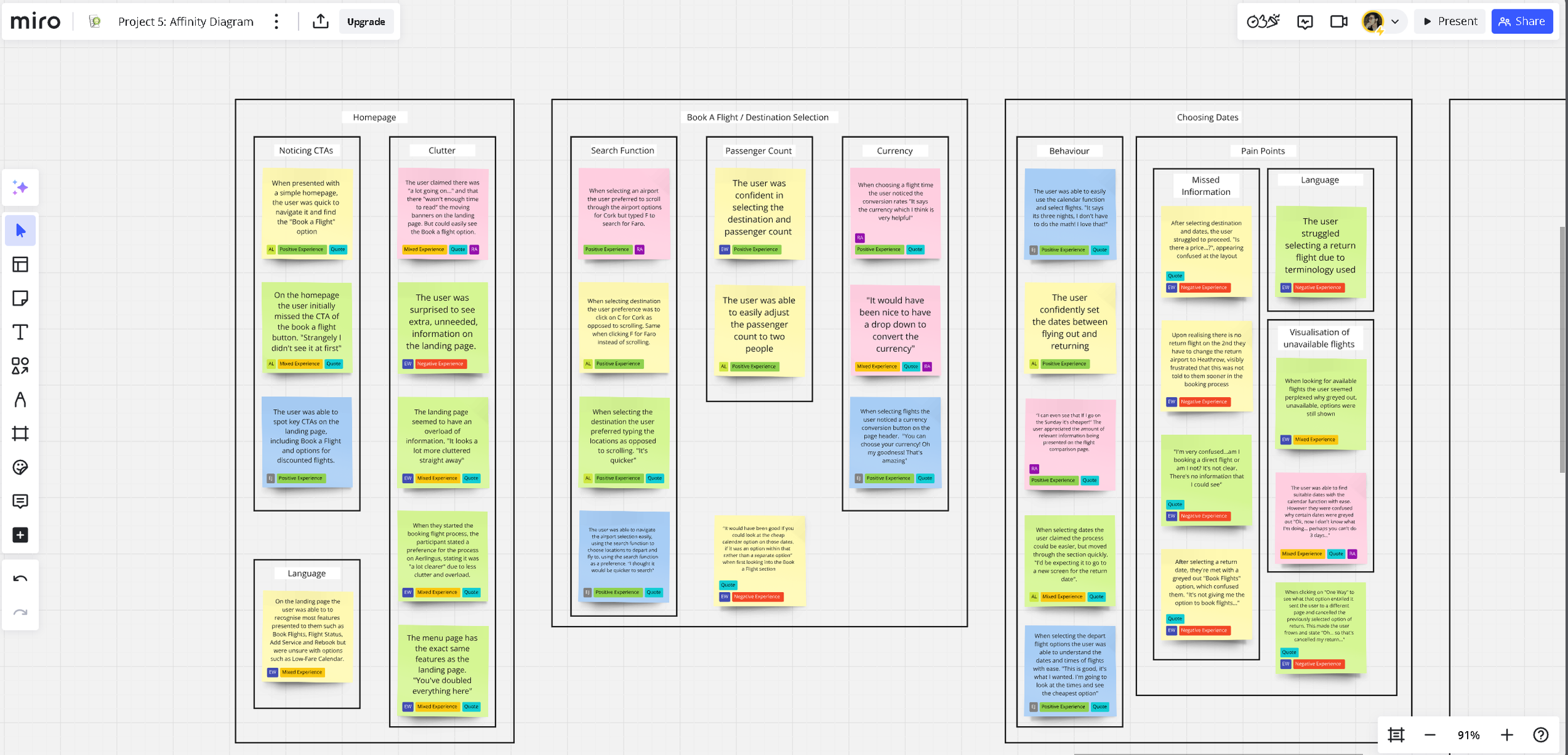
P5: Affinity Diagram
With the research stage of the overall project completed, I moved on to the Analysis block, beginning with the creation of an affinity diagram. To start with I created post-it notes of the previous two research inputs I had amounted; these notes were labelled to help convey the type of experience (positive, mixed, negative) as well as what airline they relate to and if the note is in itself a direct quote of one of the testers. Once the notes were created, I started to organising them into groupings where notes seemed relevant to one another, this over time led the creation of labelled groupings and sub-groupings which helped categorise the data I had previously built up. This previously un-organised data could now be displayed coherently, to help identify which pain-points where more universal, to show where focus should be prioritised later on in the design stage. The button below will take you to my Miro-board which displays the final Affinity Diagram I submitted, and the pictures below show the stages of the diagrams completion through screenshots taken as I built it.

Step 1: Creating concise notes based on the notes taken in Project 3 and the Usability Tests conducted in Project 4.

Step 1: Completed

Step 2: Grouping and Subgrouping the notes.
Step 2: Completed

Step 3: Final polish and placements of notes, labelling and grouping.
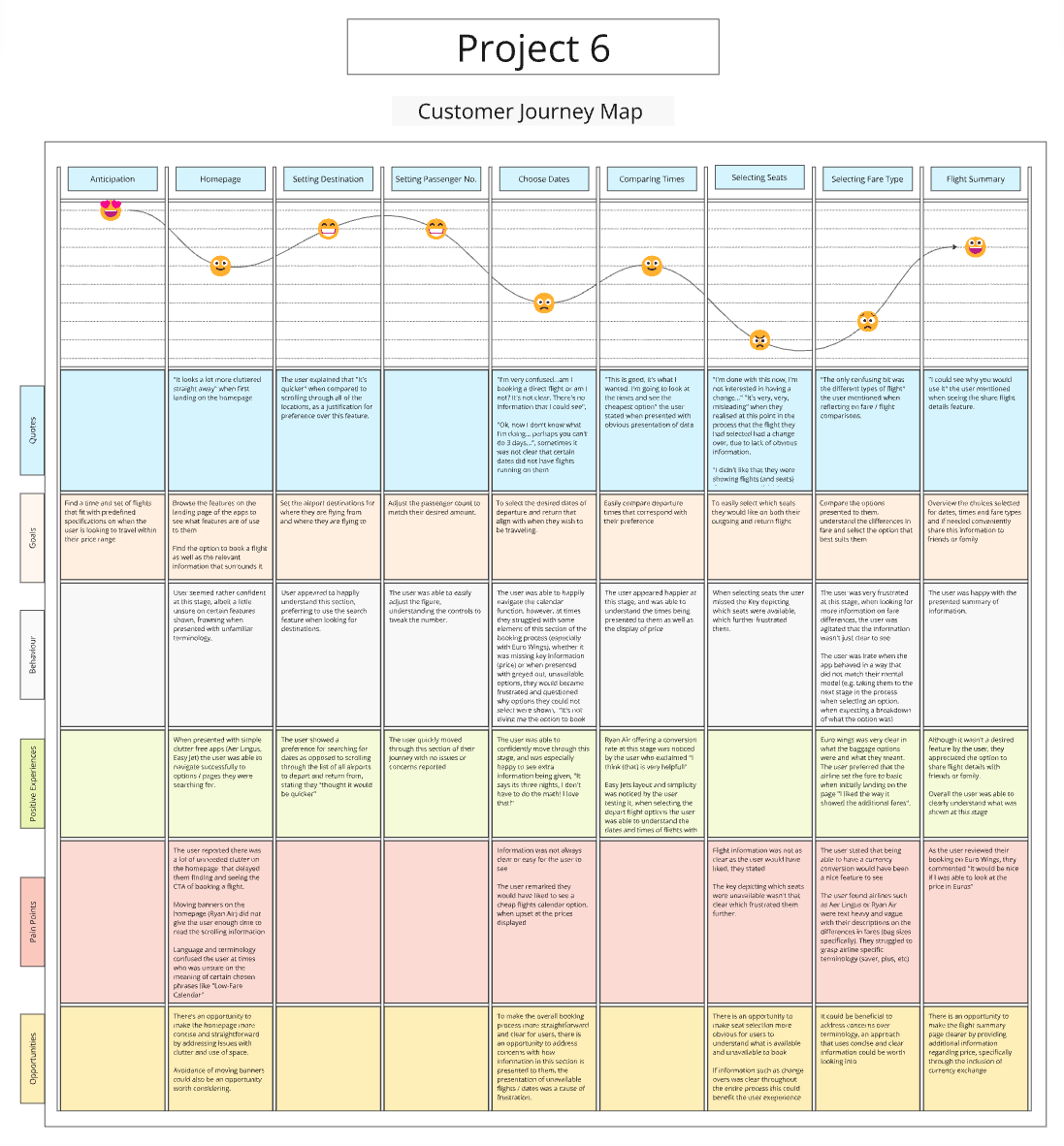
P6: Customer Journey Map
Upon completion of the affinity diagram, I began work on a customer journey map. This was built off of the affinity diagram as well as research data taken earlier on in the course, and was created to put more structure on the research. The customer journey map strives to paint an overall picture of the most common user experience, highlighting the problems and the positives, as well as the users behaviours, goals and opportunities that could be focused on going forwards. The button below will take you to my Miro-board which showcases the customer journey map, and below you will find screenshots of the work in progress and final version.

Stage 3: Design
P8: Flow Diagram
With research and analysis completed I moved on to the design stage of this project. This whole stage aimed to solve the problems previously uncovered, and utilise the opportunities found. This began with the creation of a flow diagram, which maps out every interaction and every screen state in the booking process and strives to capture every user interaction and screen state in the flow. This granular flow helped hone focus to where it was needed and avoided the possibility of it being overshadowed with concerns of UI placement and other secondary elements which were built upon later. Please click the button below to view my proposed flow diagram, or, see a screenshot of it below.

P10: Interaction Design
Upon the completion of the flow diagram, I began the creation of a low-fidelity prototype of the screen states. This sketch detailed the screens and their transitions from the homepage up to and including the booking summary. It is important to re-affirm that this project focussed primarily on the booking process of the airline app, and therefore other screens were not fleshed out or shown in some circumstances. This was created using what I had previously learnt, including the key issues and their solutions mentioned from the affinity map to the flow diagram. This sketch has instead built upon interactions and calls to action (CTA). The button below will take you to the Miro-board which hosts these sketches and their relevant annotations, alternatively you can also view a snippet of the sketches below.

Stage 4: Prototyping & Handover
P12: Prototype
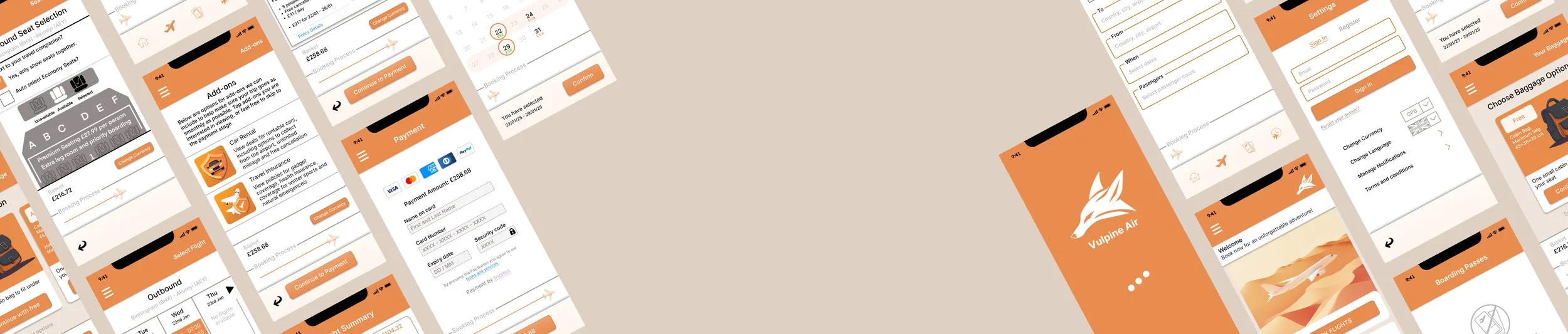
This final stage of the course accumulated all previous stages and afforded the creation of a functional medium-fidelity prototype packaged with handover notes which would work to assist future developers in creating a final build. Using the screen sketches I had previously made, I began my own research into the UI and visuals of the app. Although this was not a hard requirement of the course, I believed that a polished interactive prototype with visual elements and a clean and colourful UI could help assist the user experience through more noticeable affordances and CTAs. I settled on an orange dominant colour scheme and worked on other branding elements such as a logo and title, and then started work on creating the screens and screen states of the booking process. For convenience I have included two buttons below, the left will take you to the Figma file, here you can see different pages which include multiple variations and versions, as well as early UI tests; the right button will take you straight into a playable prototype. Below you will also find a slide show of work in progress.

1. Early stages of creating the prototype.

2. The original Payment page (Later changed as it was too crowded and didn't follow convention tap target ranges).

3. Inclusion of a loading page as well as an onboarding page for the prototype, explaining its limitations and functionality.

4. The updated payment page, now divided into two pages for summary and payment.

5. The final version of the prototype, including settings pages accessible from all screen states.
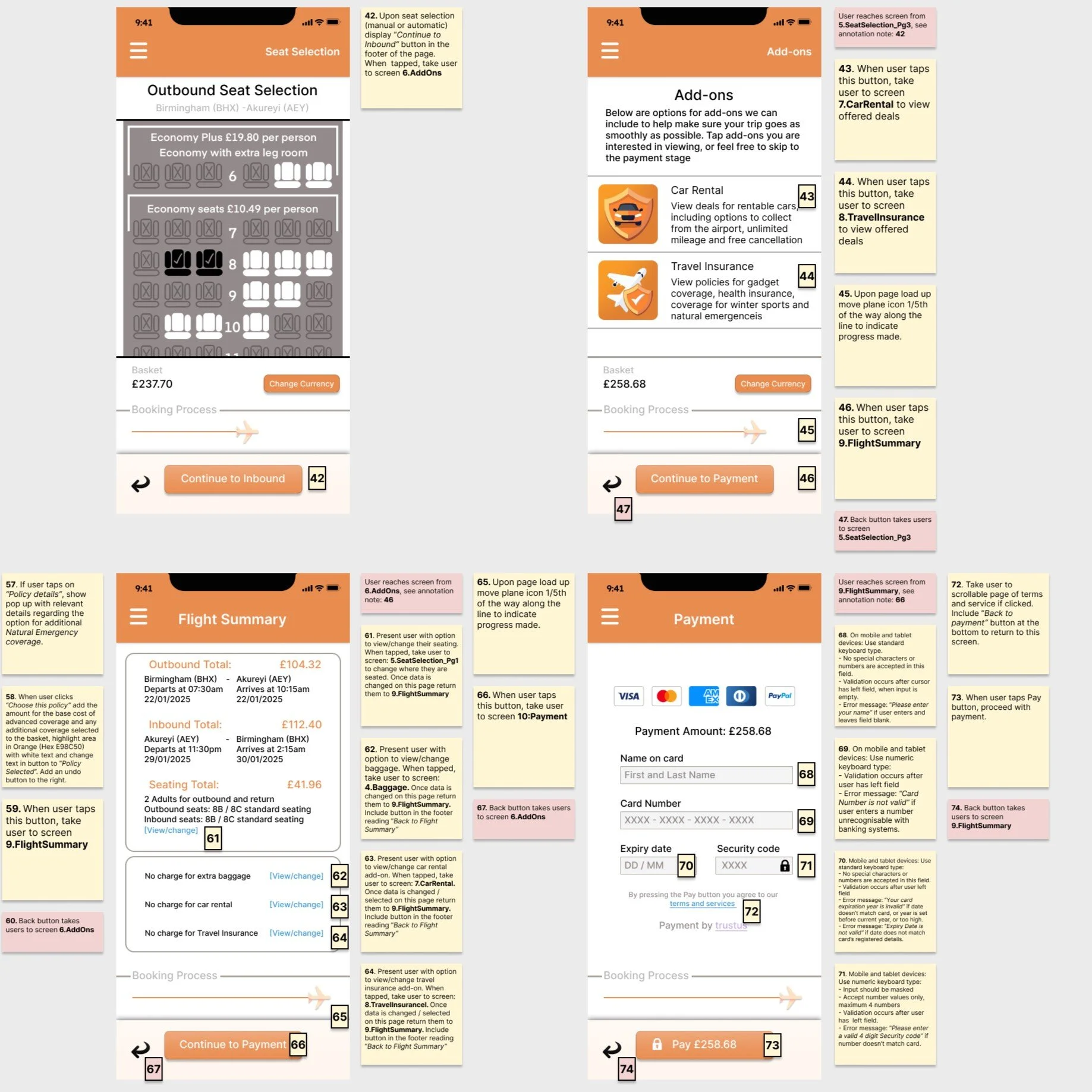
P16: Annotations
With the medium-fidelity prototype completed, the final stage of the course was to write up the design annotations. These annotations provide sufficient detail to meet the needs of developers, focussing primarily on functionality, how the system behaves and responds to actions, and communicates results. The notes also expressed which language should be used in CTAs as well as in error messages if a user makes a mistake filling in data input fields. Below you will find a button that will take you to the annotated notes in full, as well as screenshot examples of the annotated notes made.